Art, Drawings

Vessels: 3 by 3

3 by 3
Vessels: 3 by 3
Neocolor II on paper

This was a lesson in persistence. Every piece seems to go through an ugly duckling stage, but this one was all ugly duckling. It was difficult to stay motivated and to keep working on it. I ended up putting it down several times over the course of the last week. I’m glad I stuck with it, though. I’m not 100% happy with it, but it’ll do.

The background, which I really like, was colored with prussian blue and violet, which were blended with water and brush. The results were rough and mottled (and garish!) and not at all what I was after. I then went over everything with a layer of sanguine, blending it gently with a baby wipe. That knocked down the brightness and evened out the color. Another layer of sanguine and more baby wipes. Then I put in a few shadows for contrast, using raw umber and more Prussian blue.

This piece, too, is destined for the Vessels book.

Crankypantsing

Scintillating Scotoma

I’ve yet to see a good illustration of what scintillating scotoma looks like, but the bottom two images here are close.

It starts as a tiny dot at the center of my field of vision. Slowly, it expands into a larger, jagged-edged circle-ish shape. It’s not solid, though; it’s like looking through one of those cheap, mirrored kaleidoscopes. As it grows larger, the center of the circle returns to normal vision. Eventually, the entire ring will expand past my field of vision and disappear. Oh, and to make things more exciting, the whole thing vibrates. No, really! It’s a very weird experience.

Art, Journals

Sharpies: a cautionary tale

Well, several words, in fact. In my various art- and journaling-related fora, the subject of Sharpies regularly rears its ugly head. I can understand their appeal: they’re cheap, ubiquitous, and come in a wide variety of sizes and colors. However, it makes me wince whenever I hear someone say they use Sharpies, or worse, when someone recommends their use to another person. The former I usually ignore, but the latter, I think, requires a response.

The problem is that Sharpies are not archival. I realize archivalness isn’t always a primary concern when journaling. It certainly isn’t for me. That’s okay, I think, because journaling is as much about the here-and-now as it is about preserving one’s thoughts for the future. So, I include ephemera that will deteriorate over time, and in some cases I journal on papers that are bound to be full of all sorts of acidic chemicals. I know those things won’t last forever, and I’m okay with that. I’d like them to last a reasonable length of time, though.

Sharpies, unfortunately, do not even begin to pass muster on that front. The ink starts to break down almost immediately, migrating and haloing, and the acids in the inks discolor even archival paper. This example is from 12 years ago, which really isn’t that long. The inks began breaking down within just a couple of years. Somewhere, I have examples of black Sharpie, which have yellow haloing and the same pinkish-brown discoloration along the borders.
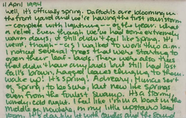
April Showers

Please, please, please, think twice about using “permanent markers” in your journals. It’s just not worth it when there are so many alternatives out there. Faber-Castell Pitt Pens are wonderful, as they’re waterproof, light-fast, and archival (recent example in composition book journal). They’re widely available at big box craft stores, as well as at most mom-and-pop art supply shops. I’m especially fond of old fashioned dip pens and India ink. Aside from being archival, light-fast, and waterproof, the variety of affordable nibs and ink colors makes them quite flexible. I enjoy writing even with a super cheap nib and pen holder (example from 1989). Most larger department stores now have crafting sections, where you can find good, affordable acid free pens, e.g. Zig, which makes several roller ball and felt tip pens and markers (example of Zig pens). The school supply department can also yield good results, though there are so many products it can be a little overwhelming. Pilot Precise roller ball gel pens are pretty decent (example from 1993). RoseArt has even come out with some cheap, fun gel markers that come in a variety of colors and tips (example of RoseArt metallic gel markers). And then there are good old Crayola markers (example from 1990).
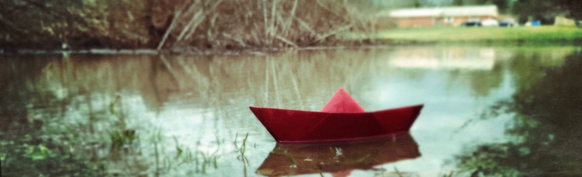
Art, Bookarts, Pets, Photography

The Blustery Day

It’s cold and snowy and windy today. The weather is supposed to clear up this afternoon, but in the meantime, it’s snowing sideways (30mph wind gusts) and the roads are icy. Yuck.

In arting news, I started on a new book last night. It’s an itty bitty (3/4″ x 7/8″) alphabet book, made out of left-over Cartiera Magnani paper (I just can’t stand to throw any of it away). Lord only knows how I’m going to manage to bind something that small, but I’m sure it’ll be an interesting experience. I’ll post pictures as I finish them.

Elliott_HarrietSM

Oh, and yesterday was Elliott’s 11th birthday. That photo was taken earlier this winter. Harriet, ever the fashion plate, is modelling the latest in Metal-wear for dogs. Elliott, bless his little heart, is standing all penguin-footed. That’s my silly dork!

Art, Collage

Two Tarts

A Book of Vessels: Tart

A Book of Vessels: Red
Top: Orange Tart
Bottom: Red Tart
collage

These are the latest two collages for the Vessels book. And, the inevitable finally happened. I knew I would eventually goof up and make a page upside down. Damn! I’m not sure what I’m going to do about it. It’ll drive me crazy to bind this into the book with wonky pages, but the alternative is to not use it. I guess that’s what I get for paying more attention to Fawlty Towers than to what I was doing, eh?

Art, Collage, Ladybusiness, Paintings

Vessels: 3 x 9

3 by 9

3 by 9 (detail)
Vessels: 3 by 9 (with detail)
mixed media on paper

This is the latest installment in the Vessels series. It’s a combination of Pitt pen, Koh-I-Noor watercolor pencils, Neocolors II water-souluble wax crayons, and collage on yummy Cartiere Magnani paper. I’m much happier with this piece than #17–not so much because I think the final image is all that much better, but because the process of getting to the end result was more satisfying.

I’m especially happy with the leaves. I usually don’t enjoy the process of cross-hatching. It’s a bloody pain in my behindermost parts to get the sort of result I want. It’s a little difficult to tell, even from the detail, but there there are layers upon layers upon layers of cross hatching, which gives a velvety depth to the drawing. The paper held up very well to this sort of abuse.

Altered Photos, Art

Altered Photos

001

Altered Photo 02

Altered Photo 03 Altered Photo 07

Altered Photo 06

Altered Photo 05

Altered Photo 08

I’ve been meaning to scan these for awhile. These were all altered with just bleach. I used Q-tips, a syringe, and my fingers to apply the bleach. I used both diluted and undiluted bleach. Caveat: if using undiluted bleach, I recommend having a tub of water handy or do your altering in the kitchen sink with the water running. You’ll need to act quickly or the bleach will completely eat away the emulsion. I found that using a syringe filled with a 50/50 bleach/water solution, pre-wetting the photo with running water, and running the photo through the water as soon as the bleach was applied worked best.

I really like the way the squarish photo of the snake turned out. That effect was gotten by filling the bottom of a lunch plate with a 50/50 bleach/water solution, dipping the center of the photo in the liquid, then immediately running it under water.