Art, Artist Books, Paintings

Rain Bird

Rainbird
Rain Bird
acrylic on paper

I spent over an hour Photoshopping this spread and the color still isn’t quite right. Tealy-aquas are a pain in the ass to reproduce, especially when there are metallics involved. Grrr. This is the first spread in the Blue Journal, which is for an Art Erratica round robin. I was supposed to get this stupid thing mailed out yesterday, but held it back so I could make scans. I figured I’d have plenty of time to get them done this ayem, then I’d run into town and pop this puppy in the mail. Now, it’s looking like that’s not going to happen until tomorrow, which will make it two days late. I suppose I could send it out as is, without getting scans first, but it’s going to be traveling for almost a year. If it gets lost or damaged, I won’t get a second chance. Who knew that it’d take me as long to scan and tweak as it did to make the bloody thing in the first place?

Anyway, this particular RR is color based. Everyone picked a color scheme that appealed to them. Mine is “underwatery blues,” so everyone who works in my book will work primarily in shades of blue.

Obviously, the Rain Bird is not anatomically correct. He’s sort of half bird, half betta fish, with feathery blue fins. I used quite a bit of metallic paint, hoping it would give a “silver lining” sort of effect. Metallics don’t scan well, but the original is nice and shimmery. Oooh, shiny!

Pets

Lemons!

There have been lots of discussions in the dog groups about weird things our dogs will eat. Sunday night, I tried grapefruit. Both dogs said, “More, pleaseandthanks!” While I was at Babbs this morning, I picked up some lemons, with the intention of seeing what they’d make of them. Elliott ate a few pieces, but was less than thrilled (he’ll eat anything I give him). Harriet is a little more picky, but will give most things a try. Surprisingly, she really seems to like lemons. Altogether, she ate about a quarter of a lemon, peel and all.

Crankypantsing

Wow

People amaze me. I guess some people are so thoroughly, completely, and desperately unhappy that they have a compulsion to try to make others just as wretched and miserable as they are. Don’t dare let them get a taste of your blood, because like sharks, they’ll swarm and attack until they devour you.

But oh! The irony! While lecturing others on the workings of Karma out of one side of their mouths, they spew such lovely pet names as skank, malicious, piece of shit, moron, stupid bitch, hateful, scum, liar, and cunt out of the other.

How overwhelmingly depressing. My cold and I shall repair to our sickbed.

Art

The Beanie!

The weather was gross yesterday–cold and sleety and grey, grey, grey. All day at work, the only thing I could think of was going home, making a cup of hot cocoa, and relaxing. When I stopped at the end of the driveway to check the mail, there was my copy of Michael Nobbs’ The Beanie. Oh frabjous day! I could hardly wait to get up to the house and dive in. I let the dogs out and opened the package. Standing at the door, where I could easily check on the dogs, I started reading. It was just as lovely as I’d imagined it would be–funny, gentle, warm, and comfortable. It also is a much needed reminder for me to try to appreciate and live every moment, even the ones that try my patience.

So, go order your copy of The Beanie now!

Art, Artist Books, Bookarts

Blue Journal

Blue Book
Blue Journal, Front
140lb Cartiera Magnani hot press watercolor paper, Coptic bound with cotton thread
8 1/2 x 7 1/2 inches, 10 signatures of 2 sheets (40 pages)

Blue Book
Spine

Blue Book
Spine detail

This is the (mostly) finished book for the art journal round robin. It’s a color-themed RR and, as you can see, my journal will be focusing on shades of blue. I used more Cartiera Magnani paper (140lb hot press watercolor paper), which should allow everyone to work in pretty much any medium they choose. The soft denim cover will, I hope, hold up well in the mail. The sewn, open spine binding is flexible and ought to allow for some expansion.

Between folding and tearing the paper down to the right size and sewing the bindings on two books today, my fingertips are hamburger and my hands ache. But, I’m finished! I still have a couple of spreads of my own artwork to do before mailing it off, but the hard part is done.

Oh, and I’ve got tons of small pieces of paper left over to make some more silly little books with. I should be able to get a couple of 3 x 3 3/4 inch books and one 2 1/2 x 1 3/4 inch book out of it.

Art, Bookarts

Dial-A-Tale Journal

Dial-A-Tale Book:  Front Cover
Dial-A-Tale Journal
exposed spine binding
7 1/2 x 7 1/4 inches

Dial-A-Tale Book:  Spine
Spine

I’m working on making a book for an art journal round robin. I knew I wanted to do another exposed spine binding, but hadn’t decided on exactly which types of stitches I wanted to use. I hadn’t done a multi-stitch binding and thought I’d give it a try. I did a test run on something a little less ambitious than the journal I’m making, though. For this I cut down a old kids’ board book and used some sketch-weight paper. It’s not the most elegant binding job, but I think I’ve got the basics down well enough to go ahead with the main course.

Art, Drawings

Vessels: 3 by 3

3 by 3
Vessels: 3 by 3
Neocolor II on paper

This was a lesson in persistence. Every piece seems to go through an ugly duckling stage, but this one was all ugly duckling. It was difficult to stay motivated and to keep working on it. I ended up putting it down several times over the course of the last week. I’m glad I stuck with it, though. I’m not 100% happy with it, but it’ll do.

The background, which I really like, was colored with prussian blue and violet, which were blended with water and brush. The results were rough and mottled (and garish!) and not at all what I was after. I then went over everything with a layer of sanguine, blending it gently with a baby wipe. That knocked down the brightness and evened out the color. Another layer of sanguine and more baby wipes. Then I put in a few shadows for contrast, using raw umber and more Prussian blue.

This piece, too, is destined for the Vessels book.

Crankypantsing

Scintillating Scotoma

I’ve yet to see a good illustration of what scintillating scotoma looks like, but the bottom two images here are close.

It starts as a tiny dot at the center of my field of vision. Slowly, it expands into a larger, jagged-edged circle-ish shape. It’s not solid, though; it’s like looking through one of those cheap, mirrored kaleidoscopes. As it grows larger, the center of the circle returns to normal vision. Eventually, the entire ring will expand past my field of vision and disappear. Oh, and to make things more exciting, the whole thing vibrates. No, really! It’s a very weird experience.

Art, Journals

Sharpies: a cautionary tale

Well, several words, in fact. In my various art- and journaling-related fora, the subject of Sharpies regularly rears its ugly head. I can understand their appeal: they’re cheap, ubiquitous, and come in a wide variety of sizes and colors. However, it makes me wince whenever I hear someone say they use Sharpies, or worse, when someone recommends their use to another person. The former I usually ignore, but the latter, I think, requires a response.

The problem is that Sharpies are not archival. I realize archivalness isn’t always a primary concern when journaling. It certainly isn’t for me. That’s okay, I think, because journaling is as much about the here-and-now as it is about preserving one’s thoughts for the future. So, I include ephemera that will deteriorate over time, and in some cases I journal on papers that are bound to be full of all sorts of acidic chemicals. I know those things won’t last forever, and I’m okay with that. I’d like them to last a reasonable length of time, though.

Sharpies, unfortunately, do not even begin to pass muster on that front. The ink starts to break down almost immediately, migrating and haloing, and the acids in the inks discolor even archival paper. This example is from 12 years ago, which really isn’t that long. The inks began breaking down within just a couple of years. Somewhere, I have examples of black Sharpie, which have yellow haloing and the same pinkish-brown discoloration along the borders.
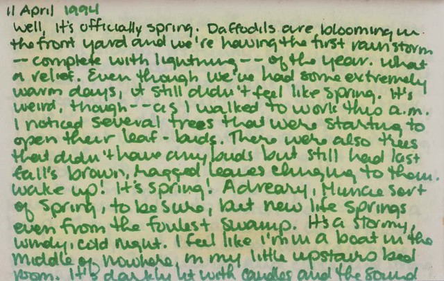
April Showers

Please, please, please, think twice about using “permanent markers” in your journals. It’s just not worth it when there are so many alternatives out there. Faber-Castell Pitt Pens are wonderful, as they’re waterproof, light-fast, and archival (recent example in composition book journal). They’re widely available at big box craft stores, as well as at most mom-and-pop art supply shops. I’m especially fond of old fashioned dip pens and India ink. Aside from being archival, light-fast, and waterproof, the variety of affordable nibs and ink colors makes them quite flexible. I enjoy writing even with a super cheap nib and pen holder (example from 1989). Most larger department stores now have crafting sections, where you can find good, affordable acid free pens, e.g. Zig, which makes several roller ball and felt tip pens and markers (example of Zig pens). The school supply department can also yield good results, though there are so many products it can be a little overwhelming. Pilot Precise roller ball gel pens are pretty decent (example from 1993). RoseArt has even come out with some cheap, fun gel markers that come in a variety of colors and tips (example of RoseArt metallic gel markers). And then there are good old Crayola markers (example from 1990).