Altered Photos, Art, Pets

Altered Photos

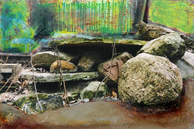
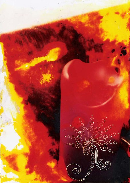
Altered Photo 11

The photo was bleached, rinsed, and dried, then rewet with a baby wipe and incised with a stylus. My doodle compulsion apparently knows no bounds.

Altered Photo 10

This photo was sanded in parts with steel wool, then incised with a stylus, then colored with Neocolors II and RoseArt ColorSharp metallic markers.

And now I really have to finish getting my shit together. I spent the day doing the headless chicken dance (car to shop for oil change and tire/brake check, dog to vet for rabies vax[1], much doing of laundry, and a Target run for road trip essentials). I have a feeling I’m not going to get to vacuuming before I go, but I have to do the dishes and clean the bathroom.

_____________________________
[1] Harriet never fails to amaze me. She is such a typical Boxer–bratty and bossy and obnoxious at home, but a perfect charmer when she has her visiting manners on. At the vet today, there was a little brindle Staffy Bull (oh. mah. gawd. was he cuuuuute!) who would not sit still. His owner told him several times to sit down and behave like “that other dog.” Haw! Harriet was lying quietly at my feet, like a good girl.

She also fawned all over the vet techs and the vet, who is a grumpy old man. Harriet does not like strange men, so I don’t know what the hell got into her. The most surprising part, though, was that she actually ate the two (two!) cookies that one of the techs gave her. She never eats food from strangers. She always takes it then spits it out.

I think my dog may have been abducted by aliens. I shall immediately commence the search for pods.

Art, Artist Books, Collage, Ladybusiness

The Remembrancer: Default

The Remembrancer:  Default

The Remembrancer: Default
collage (altered Polaroid, anatomical illustrations, and brass brad) with Neocolors II water-soluble crayons and gesso
4 3/4 x 8 1/4 inches

I really like the way the altered Polaroid turned out. The original photo was of a stack of prints (lithographs, I think) lying on the mat room work bench at the art museum. We were discussing museum self-censorship (the director had decided not to exhibit the print of the nude, because we’d recently had complaints from a community member about nude artwork), so the preparator stuck a piece of black paper over the crotch of the woman and took a Polaroid of it. At the bottom of the photo, he wrote: Museum Censorship.

I kept the picture, intending to deconstruct it and use it in my own work. I separated the emulsion from the backing and washed out the right hand side of the image with a baby wipe, leaving just a bit of red and yellow. I then pasted an image of a woman from an anatomy text behind the photo.

Art, Artist Books, Collage

Hmmm.

The Terrible Hours:  What Each Girl Should Bring
The Terrible Hours: What Each Girl Should Bring

A comment left at Flickr for the above image:

Very creative and well done, but for me a little too morbid making it uncomfortable to look at..

It seems like a pretty innocuous statement, but the more I think about it, the more I wonder, what’s the point? If taken at face value, it seems odd to me that someone would go out of their way to leave a comment that simply states that they prefer less “morbid” work. My response is, “That’s nice, dear, but what does it have to do with me?” In other words, I don’t really care what sort of art an anonymous passer-by prefers. M’kaythen!

Or is it meant to be constructive criticism? If so, good luck with that! I mean, really, telling someone that their work is too “morbid” is not exactly constructive, in that there is precious little chance that they will find it helpful, or that they will change their subject matter or style of work to accommodate your wishes.

And, I’m sorry, but “morbid”? I think that might be true of some of my pieces, but that particular collage is not one of them.

Ironically, the commenter in question has no photos in their Flickr photostream and no profile.

Art

Productivity

I regularly read several art blogs, and the main theme lately has been that folks feel they are in a summer slump. I am surprised that I don’t feel that way, because I’m used to thinking of myself as a slow worker. That, despite the fact that I’ve gotten several e-mails from people wondering how on earth I manage to do so much. Ha! I don’t. Or, at least, I don’t think that I do.

But, it’s true what they say about creating new habits. I’ve somehow managed to get into the habit of arting pretty much every single day, whether I feel like it or not. I’m really not sure how or when that happened, but I think it’s been fairly recently–the last 6-8 months, maybe? It’s become ingrained, so that I can’t even sit down to watch the news without working on something.

Art, Drawings

Blue Tree

Blue Tree
Blue Tree
wax resist (wax crayon and India ink) on leaf from 19th century patent book
9 x 5 1/2 inches

The altered books group posts monthly techniques. I hadn’t done wax resist in years–and never with India ink–so I thought I’d try it. I used RoseArt crayons, which aren’t as heavily pigmented as Crayola, but they are waxier, so they might be better suited to resist.

Blue Tree
Blue Tree
wax resist (Portfolio water-soluble crayons and India ink) on leaf from 19th century patent book
5 1/2 x 9 inches

I also did one with Portfolio water-soluble crayons. That was only almost as stupid as it sounds. The top layers of crayon washed away in areas, but I can go back in and replace them. What’s more interesting is the way the ink bloomed. There are circular spots in the top drawing, where the ink dropped onto the paper. In the bottom one, there are lines, where I used the dropper to squeeze swathes of ink along the edges of the paper. In the scans, those areas read as tears, though close up, it’s obvious that they are not.

You could use other colors of ink. Watercolor or acrylic paint mixed with a small amount of water might be interesting, too. Pretty much anything that flows well and is water-based should work.

Art, Artist Books, Collage

The Remembrancer: Blue Moon

The Remembrancer:  Blue Moon
The Remembrancer: Blue Moon
Portfolio water-soluble crayons, pencil, and gesso
4 3/4 x 8 1/4 inches

For some reason, I have a terrible time color-correcting blues. It doesn’t help that some media–like crayons and colored pencils–lose opacity when scanned. So, the color on this one is as close as I could get it, but it’s not perfect.

I’m also not a big fan of Portfolio water-soluble crayons. They’re super creamy and smeary and are just too mushy for my tastes. They also don’t layer very well, so just when you think you are building up nice, complex strata of pigment, you end up with bald spots. Hrmf!

Art, Artist Books, Collage

Distress Signals & The Soothsayer’s Palm

The Remembrancer:  Distress Signals
The Remembrancer: Distress Signals
collage (illustrations from old book, child’s dress pattern, and buttons) with gesso and Portfolio water-soluble crayons
4 3/4 x 8 1/4 inches

The Remembrancer:  The Soothsayer's Palm
The Remembrancer: The Soothsayer’s Palm
collage (film strip, old shipping label, dictionary fragment, dried flower and brass brad) with gesso, ink, and Portfolio water-soluble crayons
4 3/4 x 8 1/4 inches