I spent the afternoon going through stacks of old work, most of it from when I was in school. I found the whole endeavor pretty amusing, so I thought I’d share. And remember, it’s okay to laugh!


Inside Pandora’s Box (AKA Great Butts Alive)
oil pastel on charcoal paper mounted to cardboard
25 x 19 inches
The figure drawing is pretty awful, but this is the project that made me fall in love with oil pastels. I love the glowing translucence and blendability. It’s tedious, but if you layer and blend them well, the result is gorgeous.

litho crayon on newsprint
18 x 12 inches

graphite and ink wash on newsprint
18 x 12 inches

ink on paper
18 x 12 inches

graphite on paper
24 x 18 inches

pencil on newsprint
24 x 18 inches
I still love drawing bones. The newsprint in the second skeleton drawing has yellowed quite a bit. I had to really knock up the contrast in order to get the pencil to show up.

Gesture drawing
litho crayon on newsprint
18 x 24 inches
I haven’t done gesture type drawings in ages–probably not since I finished school. I didn’t appreciate this one at the time, but I kind of like it now.

Hand with Leaf
ink and pencil on paper
12 x 18 inches
Stippling is right damn tedious, which is probably why I didn’t finish this drawing. I just don’t have the patience for it. I like the way it looks, though.

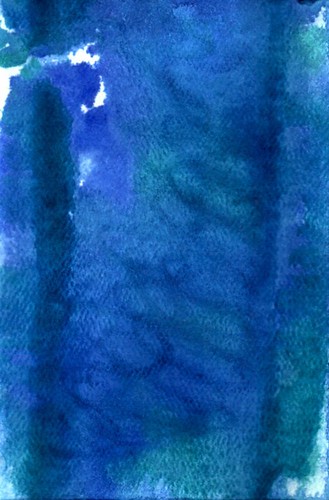
Weeping Willow
watercolor on 140lb hot press paper
3 3/4 x 5 1/2 inches
I hated watercolor class. I don’t feel like I learned how to handle the materials (or even what proper materials to use). The critiques weren’t helpful, either. I would much rather have a mean, but honest, critique than a nicey-nice one. The instructor seemed more concerned with not hurting people’s feelings than with giving us useful information. Hrmph. And that’s when I got a critique. Half the time, she skipped right over my work. I assumed at the time that she just didn’t have time for anyone who wasn’t a watercolor major. This is the only thing I was able to salvage from that class. Pathetic, isn’t it?

Sleeping Cougar
Prismacolor on toned paper
12 x 12 inches
This is part of a triptych. The assignment was to show something morphing, so I changed a house cat into a cougar. The other two drawings have gotten damaged, but that’s probably just as well. They’re really not good. I love the rocks in this one, though, and the way the cougar blends into them.

Absurdist Theater (or The Onion Head Bird People)
acrylic and oil on 140lb rough watercolor paper
15 x 22 inches
This is just a silly painting that resulted from me wanting to use up some odds and ends on my palette. I swiped the paper from the trash can in the painting studio. It’d been thoughtfully primed with a coat of black gesso.